

CONTEXT
The Challenge
YPN needed to transform a limited brochure website into an accessible centre for advocacy, resources, community connection and practical support.
From an online noticeboard to a platform for real community.
The Youth Pride Network—YPN—is a group of LGBTIQA+ young people using systemic advocacy to pursue a Western Australia in which all LGBTIQA+ young people are included, accepted and celebrated by their communities.
Its work extends across advocacy, education, peer connection, consultation and community support. YPN provides young people with a platform while also contributing lived-experience knowledge to conversations involving community organisations and government.
Its previous website communicated very little of that scale.
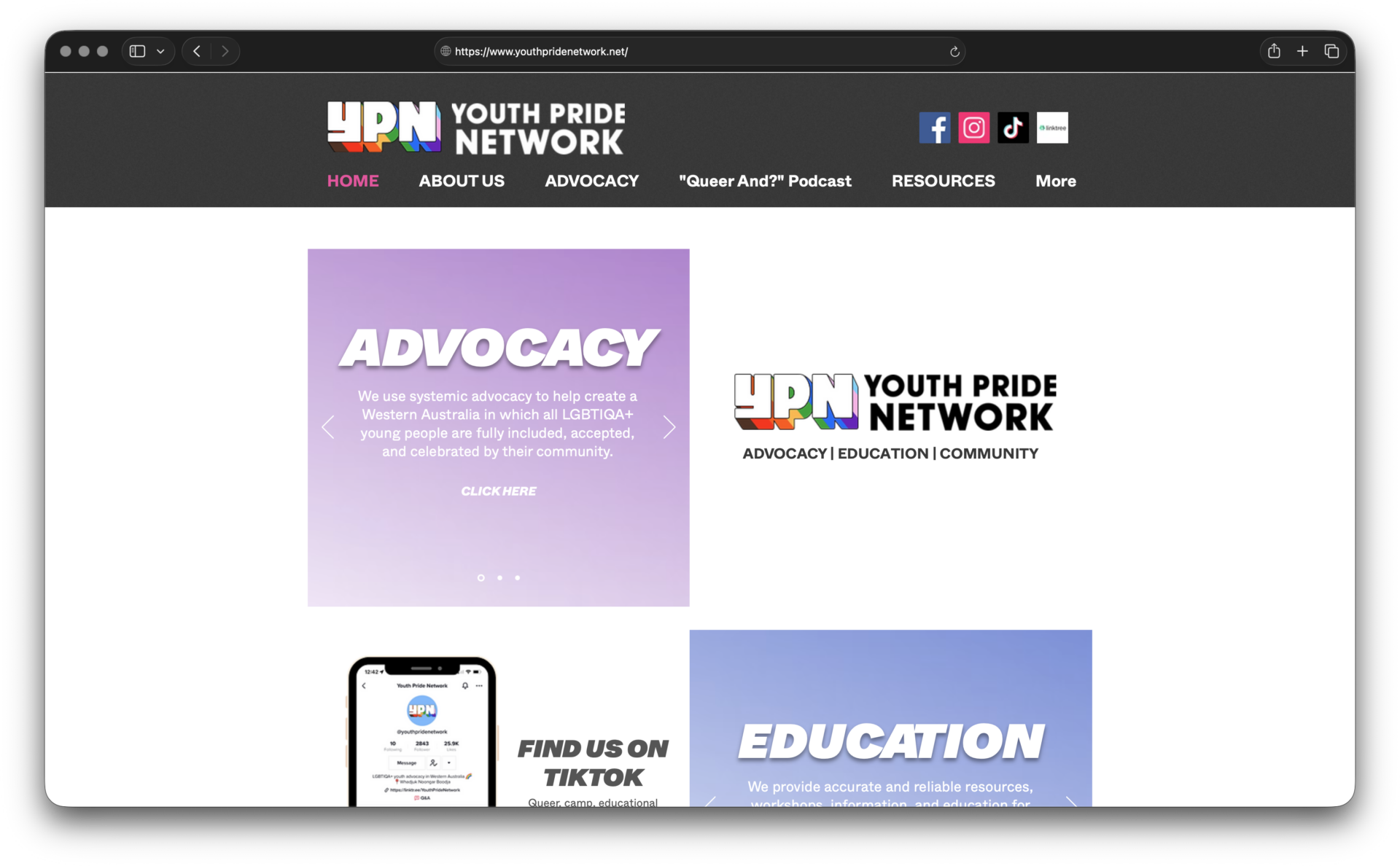
The platform functioned primarily as an online noticeboard for announcements and events. It contained limited original content, while an embedded Instagram feed carried much of the organisation’s visible activity on the homepage.
For a young and highly active organisation, the website was passive. It did not adequately explain YPN’s work, make resources easy to discover, represent its community leadership or provide meaningful assistance to someone arriving with a specific need.
Social media remained important for timely updates and community activity, but it could not perform every role required of YPN’s primary digital platform.
Supported through government grant funding, YPN set out to create something substantially more useful: a credible and accessible resource centre for its community, supported by an interactive Safe Space Map that could help LGBTIQA+ young people discover affirming services, programs and spaces throughout Western Australia.

FOUNDATION
Why SLICK?
YPN selected SLICK for our experience creating community and healthcare platforms that connect people with useful information, services and support.
A digital brief grounded in inclusion and usefulness.
Following a competitive tender process, YPN selected SLICK to design and develop the new platform.
Our experience creating community and healthcare websites was directly relevant, particularly where a digital experience needs to connect users with information, support or services rather than simply promote an organisation.
SLICK’s approach to content management was equally important.
YPN needed a sophisticated website, but it did not want to become dependent on a developer whenever information changed. Its team needed to create pages, publish resources, update activities and manage Safe Space listings without being constrained by a rigid system.
The project therefore needed to reconcile several requirements.
The website had to communicate the full scale of YPN’s advocacy, education and community work. It needed to make services and resources easier to discover, present the organisation’s leadership clearly and strengthen YPN’s credibility with community and government stakeholders.
It also needed to deliver a genuinely useful Safe Space Map, support users with different ages, identities and access needs, and target a minimum WCAG AA accessibility rating across the site.
Behind all of this, YPN needed practical control over future content and map listings.
The measure of success would not be whether the new website looked more contemporary. It would be whether more people could understand YPN, find the right information and confidently use the platform.
DISCOVERY
Inclusive Consultation
Successful inclusive design required our team to understand YPN’s audiences, language and lived experience before deciding how the website should work.
Beginning with language, audiences and lived experience.
The project began with an extended consultation phase involving workshops with YPN’s team. These sessions allowed SLICK to understand the organisation’s activities, audiences, responsibilities and ambitions. They also helped our team become more fluent in the language, tone and representation required when communicating with diverse LGBTIQA+ communities.
This learning was fundamental.
Inclusive design could not be achieved through colour choices, technical testing or accessibility tools alone. It also depended on whether users could recognise themselves in the language and content, whether information avoided unnecessary assumptions and whether any audience was made to feel secondary or excluded.
YPN contributed direct knowledge of its communities and the barriers young people can encounter when looking for information, connection or support. SLICK translated that knowledge into digital strategy, content structure, navigation and interaction design.
While LGBTIQA+ young people were central, the website also needed to serve youth workers, schools, healthcare professionals, community organisations, queer Aboriginal and Torres Strait Islander people and allies, families, peer advocacy organisations and government stakeholders. Each group arrived with a different purpose and level of prior knowledge.
The platform had to accommodate those differences without fragmenting YPN’s identity or making visitors understand the organisation’s internal structure before they could find relevant information.
USER EXPERIENCE
User Journeys + IA
We reorganised YPN’s growing content around the intentions of real users rather than the organisation’s internal structure.
Designing pathways before pages.
SLICK created user journeys during the UX phase to demonstrate how different audiences would enter, navigate and engage with the website.
These journeys helped the project team test the experience against real user intentions.
A young person might be searching for an affirming program nearby. A teacher could need resources for supporting students. A youth worker might be seeking training. A healthcare professional may want guidance relevant to their work. A government stakeholder could be reviewing YPN’s policy submissions, advocacy programs or community leadership.
Those needs should not require every visitor to understand YPN’s internal organisational structure before locating the right content.
Navigation became a critical part of the design and development process.
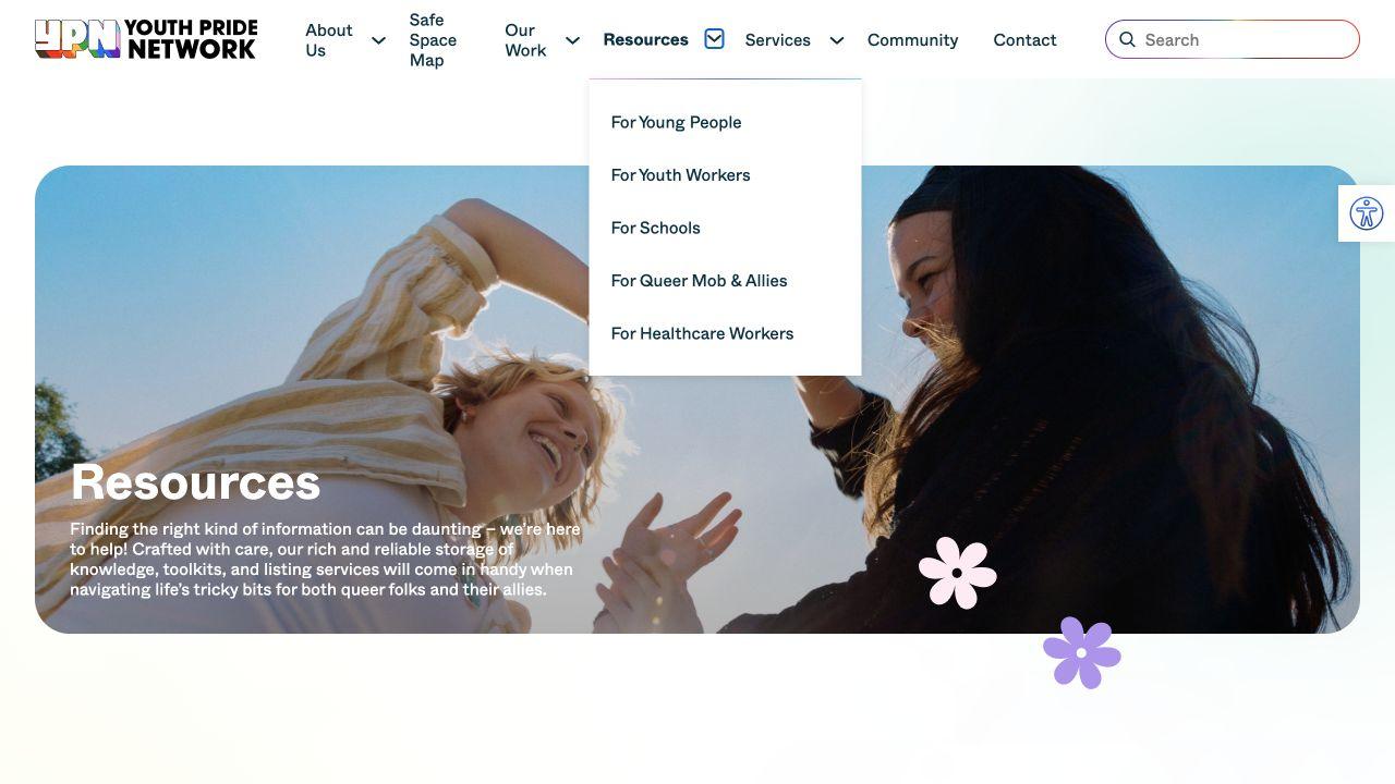
The new information architecture separated content into clear areas covering YPN’s identity and leadership, the Safe Space Map, advocacy and policy work, resources for specific audiences, training and consultation services, community activity and opportunities to connect.
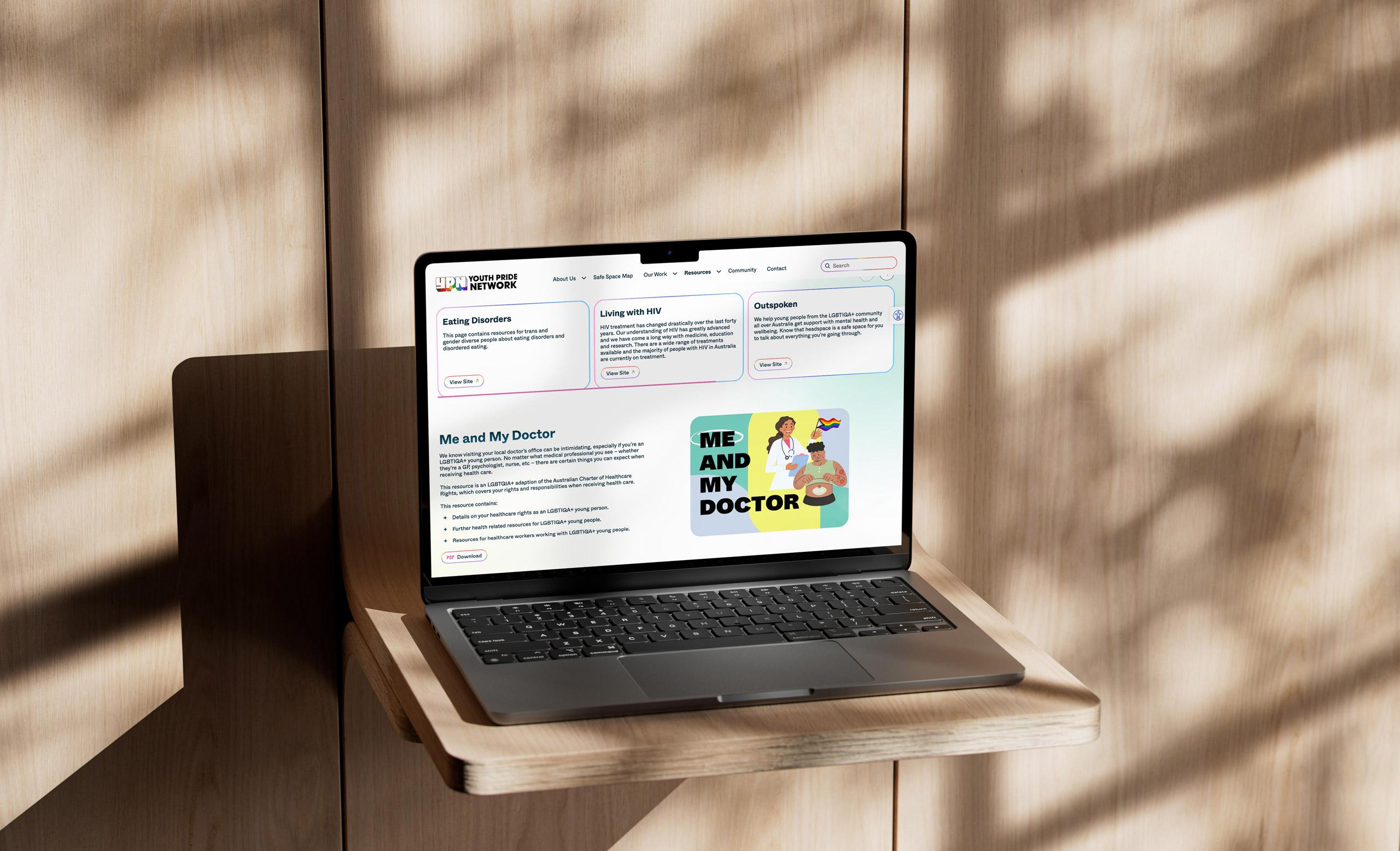
Audience-specific resource pathways were created for:
- Young people.
- Youth workers.
- Schools and educators.
- Queer Aboriginal and Torres Strait Islander people and allies.
- Healthcare workers.
The structure transformed the website from a sequence of updates into a navigable body of organisational knowledge.
Social media could continue doing what it does best—supporting immediacy, conversation and community activity—while the website became the stable source for YPN’s services, resources, advocacy and public identity.

ACCESSIBILITY
Designing for Everyone
WCAG AA was established as a minimum project target, shaping the site’s structure, visual design, content and interactions from the beginning.
Inclusion built into every interaction.
Accessibility was treated as a site-wide project requirement rather than a technical check performed shortly before launch.
YPN and SLICK considered the needs of people with vision impairments, visitors navigating with screen readers, keyboard users and those who may experience difficulty with contrast, text size or conventional interface patterns.
Accessibility influenced design, content and development decisions throughout the platform. Considerations included colour contrast, typographic hierarchy, page structure, heading order, alternative text, form labelling, keyboard navigation, screen-reader compatibility and clear, predictable interaction patterns.
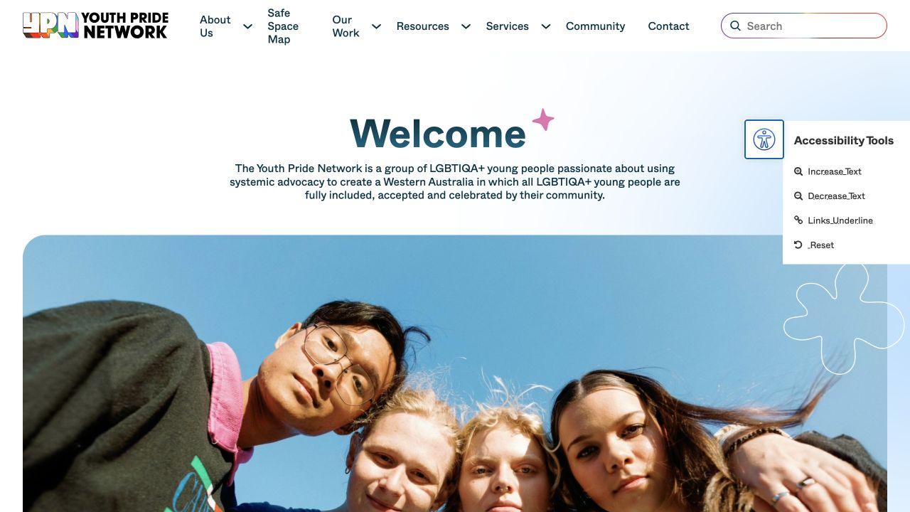
The live website also provides a direct skip-to-content pathway and user-facing controls for increasing or decreasing text size and making links more visible.
These requirements had to coexist with YPN’s colourful and expressive identity.
Accessibility was not interpreted as a reason to make the website visually neutral. Instead, it became a framework for ensuring the brand’s energy could be experienced by as many users as possible.
The outcome demonstrates that an accessible website does not need to sacrifice personality, and an expressive website does not need to sacrifice inclusion.
DIGITAL IDENTITY
Extending the Brand’s Visual Language
Rather than replacing YPN’s recognised identity, SLICK expanded it into a brighter and more flexible system for digital communication.
A digital expression that feels credible, active and unmistakably YPN.
YPN’s established logo and primary colours were retained, protecting the identity already recognised by its community. SLICK instead expanded the system so it could support a larger and more expressive digital experience.
A fluid gradient system introduced movement and variety while drawing from the energy of the existing palette. The website’s overall appearance was brightened, creating an environment that felt optimistic, welcoming and active.
The expanded visual language allowed individual sections and content types to feel distinctive without becoming disconnected from the wider platform.
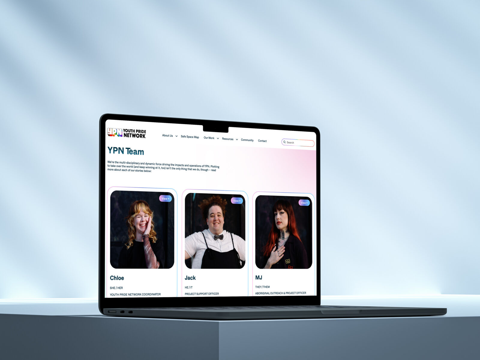
Photography, generous typography, colourful gradients and expressive graphic details gave YPN’s community a visible presence throughout the experience. Clear spacing and hierarchy ensured that visual character did not compete with usability.
This balance was particularly important for a platform containing serious policy work, practical resources, community activities and support information.
The website needed to feel celebratory without trivialising the challenges its users may face, and credible without adopting an institutional tone that distanced it from young people.
INTERACTIVITY
Safe Space Map
A conventional location map was not enough. Users needed to understand whether a service was genuinely appropriate before taking the next step.
A map designed around suitability, not proximity alone.
The Safe Space Map was the project’s most significant custom feature.
Its purpose was to help LGBTIQA+ young people discover affirming services, programs, events and community spaces throughout Western Australia.
A conventional map would not have been sufficient. Proximity does not automatically make a service appropriate or accessible.
Before attending, users may need to know whether a program is suitable for their age, whether it is free, whether booking is required, whether drop-in attendance is permitted or whether a parent or guardian needs to be involved.
They may also need to understand who the service is designed for, when it operates and whether it is appropriate to their identity or circumstances.
The map was therefore developed as a structured directory as well as a geographic tool.
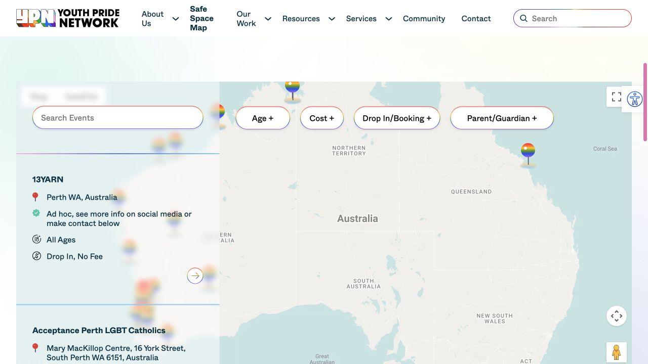
Users can search listings and filter results by:
- Age eligibility.
- Cost.
- Booking or drop-in requirements.
- Parent or guardian involvement.
Results appear through both map markers and readable listing cards, allowing visitors to explore in the way that best suits them.
Individual entries can provide an address, schedule, eligibility information, participation requirements, cost, description, contact pathway and booking information.
The content model also accommodates services created for particular communities. A listing can communicate whether it is appropriate across genders or specifically intended for a defined group—for example, LGBTIQA+ Aboriginal and Torres Strait Islander young people.
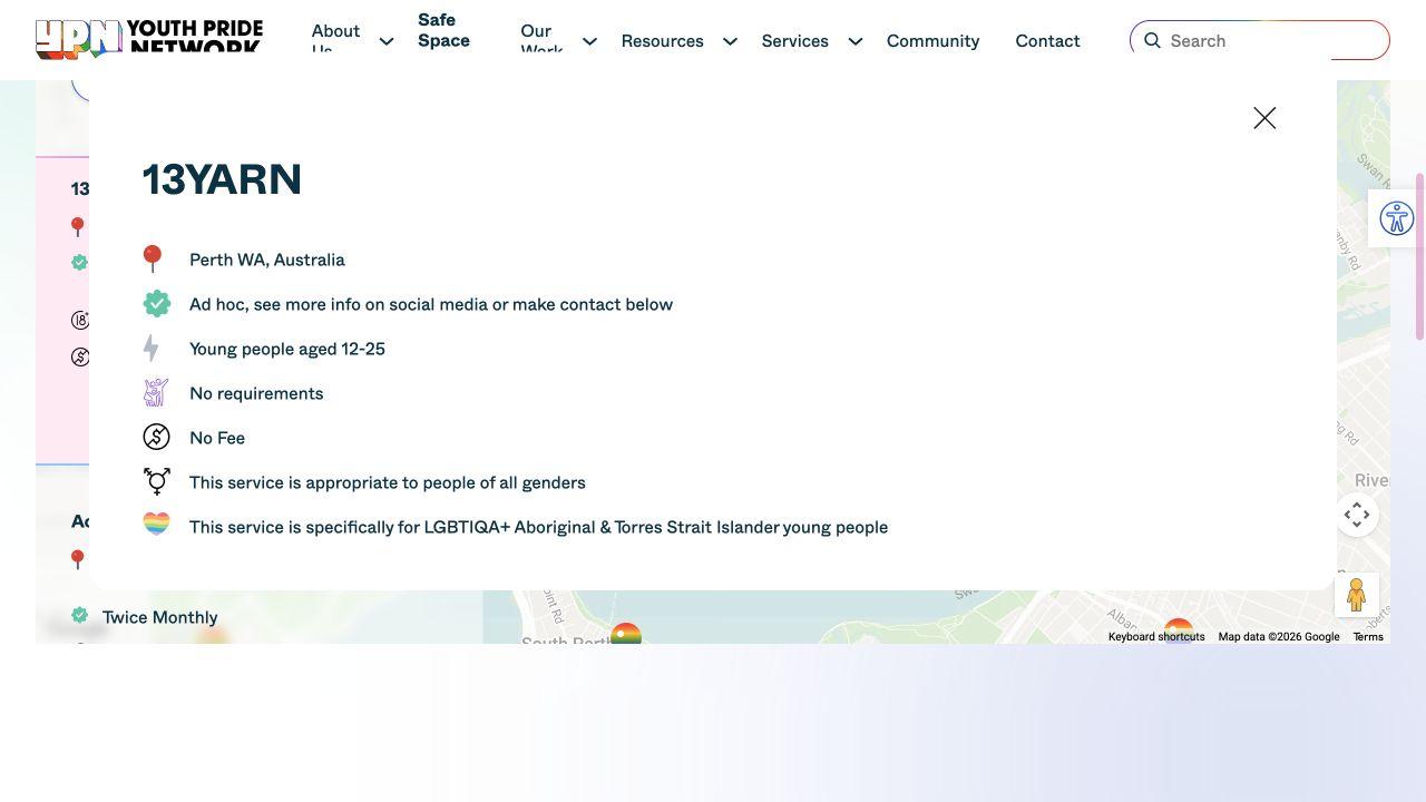
This level of detail recognises that LGBTIQA+ young people are not one uniform audience.
Age, culture, disability, location, finances, family involvement and other circumstances can influence whether a service feels safe or is practically available. Those considerations are given a visible place in the experience rather than being buried inside a general description.
A tool intended to reduce barriers should not create a new one by directing someone toward a service that cannot meet their circumstances.
GOVERNANCE
CMS built to Evolve
SLICK engineered a sophisticated front end while giving YPN practical control over pages, resources, forms and Safe Space listings.
Complex behind the scenes, simple for YPN to manage.
The website was built using SLICK’s customised implementation of the WordPress block editor. The system combines flexible page building with defined design controls. YPN can assemble and update content using reusable blocks without needing to design every page from the beginning or engage a developer for routine changes.
Our approach balances independence with governance.
The website’s backend includes reusable page-building blocks, structured content types, tailored fields, smart contact forms and central management of the Safe Space Map.
Safe Space information is managed within the same CMS as the wider website. YPN does not need to maintain a disconnected database or rely on SLICK to make every listing change.
The interface manages the relationship between structured listing data, filters, map markers, cards and the detailed information presented to users.
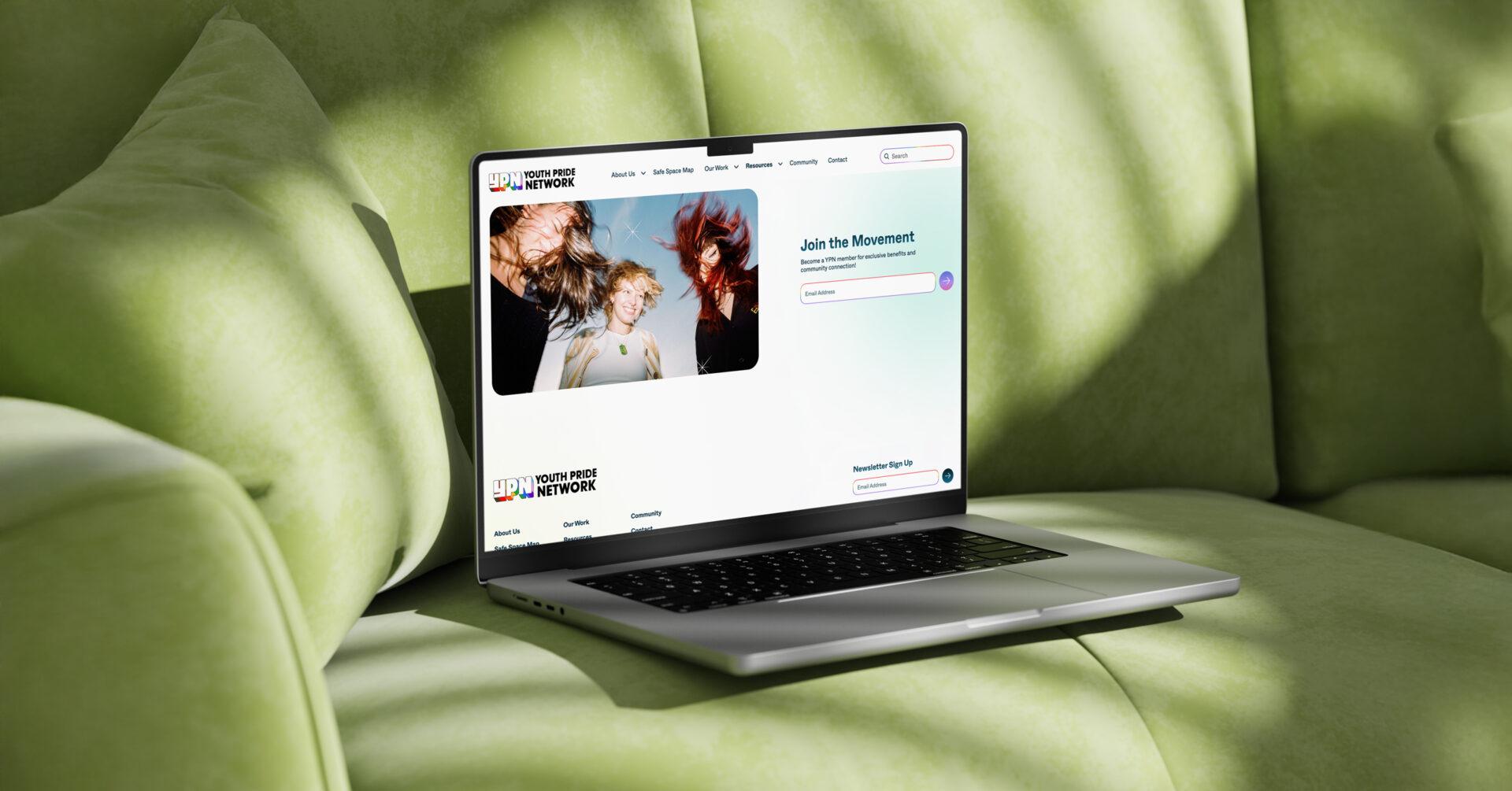
A public submission pathway also allows community organisations to propose a service, program or event for inclusion on the map.
The form captures contact information, organisation, address, timing, social-media details, booking information, supporting files and a description of the activity. Submissions are sent to YPN for review rather than being published automatically.
This moderation process protects governance and allows YPN to assess whether a proposed listing is appropriate before making it visible to young people. At the same time, it provides a scalable way for the directory to grow as new services and safe spaces emerge throughout the state.
OUTCOMES
A Living, Breathing Platform for Good
The website has strengthened community engagement, improved external understanding of YPN and continued evolving in response to real use.
From website launch to an evolving community resource.
YPN’s team and communities responded enthusiastically to the new website and Safe Space Map. As people began using the tool, YPN gathered observations and engagement information and shared those insights with SLICK. This informed post-launch improvements to the map’s UX and UI.
The iterative process allowed the experience to respond to real behaviour rather than assuming every user need could be predicted during development. Navigation, information presentation and interaction details could be refined as the team learned how people were using the tool.
YPN reported deeper engagement with peer organisations and local and state government following launch. The website gives those stakeholders a clearer view of the scale and scope of YPN’s advocacy, services, resources, leadership and community activity.
The organisation’s work had always extended beyond the limited impression created by its previous site. The new platform made that reality visible.
The project received independent industry recognition when Youth Pride Network was named a finalist in the Not for Profit category of the 2025 Australian Web Awards.